Table of Contents
Here’s a myth worth retiring: the idea that making a small space feel bigger means painting everything stark white and getting rid of most of your belongings. Plenty of genuinely spacious-feeling studios have color, personality, and real stuff in them. What they have in common isn’t emptiness. It’s a handful of specific visual decisions, mirror placement, light, sightlines, color continuity, that most people never think to make deliberately.
None of these tricks add a single square foot to your lease. What they do is change how your eye reads the room, and that perception is doing most of the work when someone walks in and says a space “feels bigger” than they expected. This guide covers them in order of impact, starting with the single biggest-payoff change and working down to the smaller details that finish the job.
The Biggest Lever: Mirror Placement
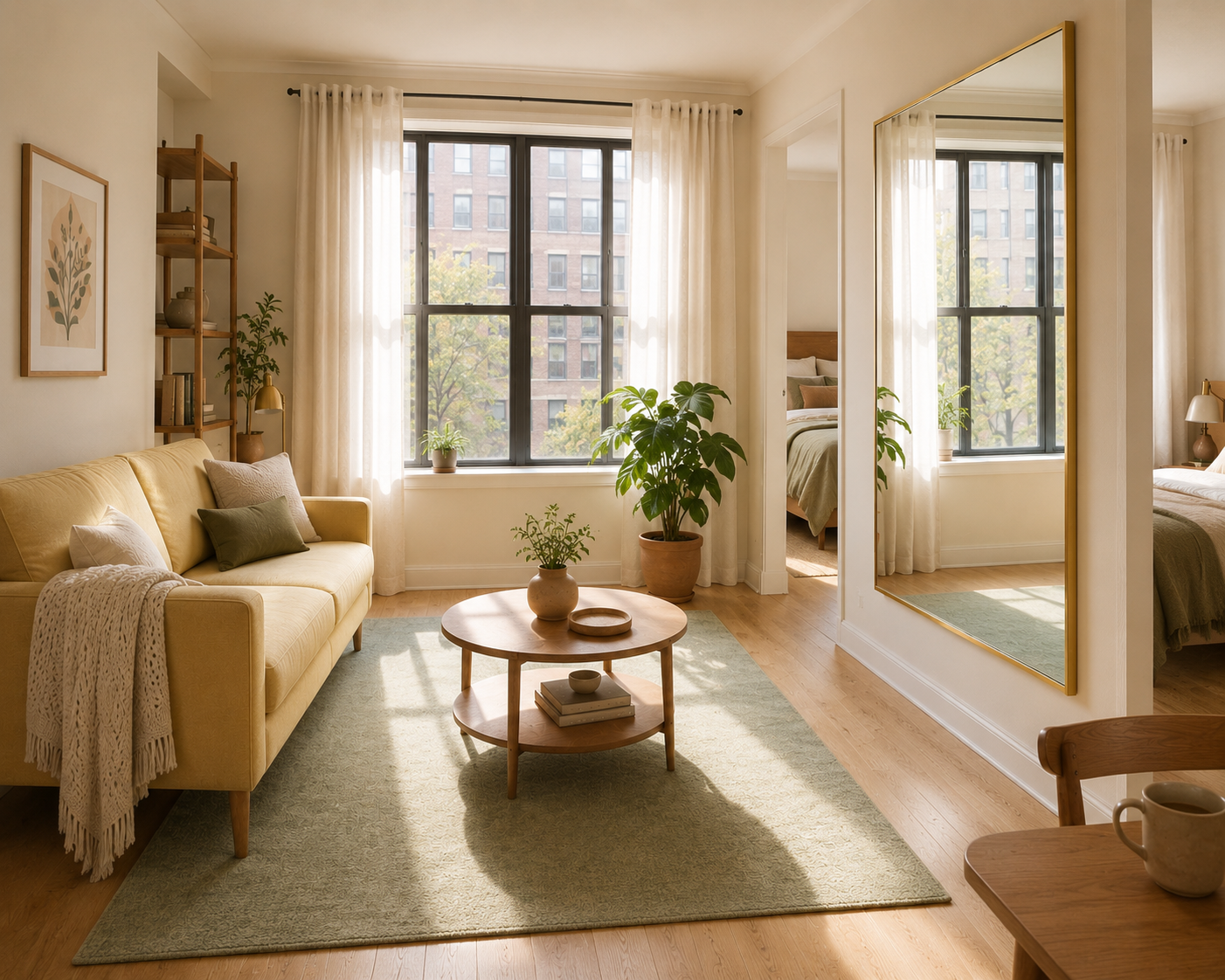
A large mirror, positioned directly across from your main window, is the single highest-impact, lowest-cost change available in a rental. It does two things simultaneously: it bounces natural light deeper into the room, and it visually doubles your sightline, since your eye reads the reflected space as genuine additional depth rather than a flat reflective surface.
The placement matters more than the mirror itself. A mirror on a side wall or an interior wall reflects whatever’s directly across from it, which is often just more furniture or a blank wall, and does very little for the room’s perceived depth. A mirror positioned to catch the window directly, reflecting sky, light, and the outdoor view back into the room, is what actually creates the illusion of a second window and additional depth.
Size guidance: Go as large as your wall and budget genuinely allow. A mirror under 24 inches wide reads as a decorative accent rather than a light and depth tool. Look for something in the 30-to-48-inch range if your wall space allows it, either a single large piece or a cluster of two or three smaller mirrors angled to catch light from slightly different points in the room.
Frame style: A thin metal frame (brushed gold, black, or brass) reads as more architectural and less like “a mirror was hung here,” which matters if you want the effect to feel intentional rather than like an obvious small-space trick.
Renter-friendly hanging: Command strips rated for the mirror’s actual weight, or simply leaning a large, well-anchored mirror against the wall rather than hanging it, both work without drilling. A leaning mirror has the added benefit of a slight forward tilt, which can actually improve how much of the room it reflects compared to a flush-mounted one.
Second Lever: Color Continuity, Not Color Elimination
A studio decorated in a narrow, cohesive range of light-to-mid tones reads as noticeably more open than the same square footage broken into several bold, competing colors, even when the total amount of color in the room is similar. This is a continuity effect, not a brightness effect, which is why the all-white myth misses the actual mechanism at work.
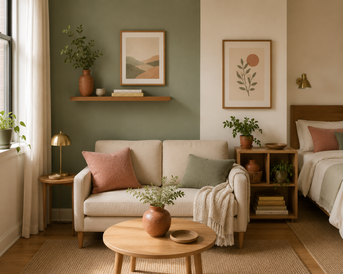
The mechanism: when your eye moves across a room and hits several unrelated colors at full saturation, it processes each one as a separate visual “stop,” which fragments the space into perceived sections. When colors share a similar tone or saturation level, even across different hues, sage green, dusty rose, warm cream, butter yellow, your eye reads them as one continuous palette and glides across the room instead of stopping repeatedly.
The practical rule: Pick one dominant neutral (a warm cream or soft white works for most studios) and two to three accent tones that share a similar muted, soft saturation level. Avoid mixing one saturated, bold color (a bright red or navy) with several pale, muted ones, since the contrast itself is what fragments the space, not the presence of color.
Where this matters most: Textiles, curtains, throw pillows, a rug, are the fastest way to apply this rule without repainting anything, which matters in a rental where wall color often isn’t negotiable. If you can paint, a single soft, warm neutral across the entire studio, rather than different colors marking different zones, reinforces the same continuity effect at the largest scale in the room.
Third Lever: Vertical Sightlines
Where you stop the eye vertically matters almost as much as what happens horizontally across the floor. A room where curtains, shelving, and art all stop at roughly the same height (say, 6 feet) creates a visual ceiling well below the actual one, which makes the room feel shorter and more boxed in than it is.
Curtains: Hang curtain rods as close to the ceiling as your window trim allows, rather than directly above the window frame. This single change stretches the vertical sightline from the floor nearly to the ceiling instead of stopping at the frame, and it’s one of the most consistently underused tricks in small-space decorating. Match the curtain color to your wall color, per the continuity principle above, so the fabric doesn’t reintroduce a visual stop point partway up.
Shelving: A tall, narrow bookshelf that runs close to ceiling height draws the eye upward and reinforces the room’s actual vertical dimension, whereas a short, wide dresser or credenza keeps the eye locked at a lower horizontal band.
Art placement: Hang the top of a large piece of art or a gallery arrangement closer to the ceiling than eye level, rather than centered at standard gallery height. In a studio, a few inches of extra height on your art placement does real work in stretching the room’s perceived proportions.
Fourth Lever: A Clear Entry Sightline
Whatever your eye lands on first when you walk through the front door sets the emotional tone for the entire apartment, and it happens before you’ve consciously registered anything else in the room. A cluttered, busy, or visually heavy first sightline reads as “small, cramped apartment,” even if the rest of the space beyond it is genuinely well organized.
Walk through your own front door and pay attention to the first three seconds of what you see. If the answer is a pile of shoes, a stack of mail, or the back of a tall bookshelf, that’s the fix to prioritize before almost anything else on this list, since it’s the single detail doing the most to color a visitor’s (and your own) first impression of the space every single time you come home.
What to prioritize in that sightline: A clear stretch of floor, a single well-placed piece of furniture or art, or a glimpse toward your best window. Anything visually busy, a cluster of small objects, a tall stack of storage bins, a mess of cords, should be positioned out of the direct line of sight from the door, even if it stays in the room.
A quick fix for rentals: If your entry immediately faces the kitchenette or a storage-heavy zone, a slim room divider or the perpendicular bookshelf covered in the zoning system can redirect that first sightline toward your living area instead, without any construction involved.
Fifth Lever: One Continuous Floor Plane
A studio with one dominant flooring type and a small number of coordinated rugs reads as more open than a room where flooring or rug styles change dramatically zone to zone. This doesn’t mean every rug has to match exactly, it means they should feel like they belong to the same visual family rather than competing patterns and colors fighting for attention across the floor.
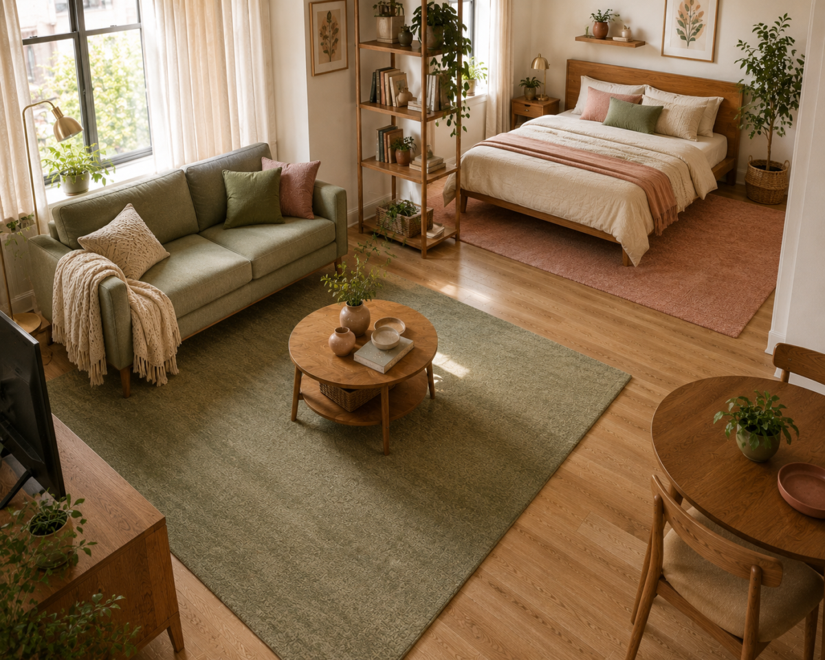
Pick a rug family, not just individual rugs. A textured jute rug in the living area and a patterned, high-contrast rug in the sleep zone will visually chop the floor into two disconnected spaces, even if each rug looks good on its own. Choosing rugs within the same general tone range, two solid, muted colors, or two simple, low-contrast textures, keeps the transition between zones feeling coordinated rather than abrupt.
Watch your flooring transitions. If your studio has mixed flooring (tile in the kitchenette, wood or carpet elsewhere), keep the transition point as visually minimal as possible, and let your rug choices bridge the two materials rather than emphasizing the seam between them.
Small Details That Round Out the Effect
A few smaller-impact tricks are worth adding once the five levers above are in place, since they finish the effect without doing much heavy lifting on their own.
- Glass and acrylic furniture pieces (a glass-top side table, an acrylic accent chair) let sightlines pass through rather than stopping at an opaque surface, which is especially useful in a tight zone where a solid piece would visually block the space behind it.
- Fewer, larger accessories instead of many small ones. A single substantial vase or plant reads as more intentional and takes up less visual “noise” than a cluster of five small trinkets competing for attention on the same shelf.
- Warm, layered lighting instead of one bright overhead source, covered in more depth in the zoning system, since layered light pools also reinforce the sense of a larger, more considered space rather than one flatly lit room.
- Keep at least one wall genuinely empty. A studio with every surface filled, shelving, art, hooks, leaves the eye nowhere to rest, which paradoxically makes the room feel busier and smaller, not more curated. One deliberately bare wall gives the whole space room to breathe.
Putting the Levers in Priority Order
If you can only tackle one or two of these this month, start with the mirror. It’s the single fastest, cheapest, highest-impact change on this list, and it requires nothing beyond a hook or a lean against the wall. From there, curtain height and your entry sightline are the next two highest-payoff fixes, since both take under an hour and cost little to nothing if you already own curtains or just need to rearrange what’s near your front door.
Color continuity and floor plane coordination take longer to fully execute, since they often mean replacing textiles rather than just repositioning what you already have, but they compound with everything above them. A studio with all five levers working together doesn’t just feel bigger. It feels finished, intentional, and genuinely calm to come home to, which is the real goal underneath all of it.
Frequently Asked Questions
Does painting a studio apartment white actually make it feel bigger? Not on its own. What actually creates the effect is color continuity, a narrow range of tones that share a similar saturation level, rather than white specifically. A studio in soft, coordinated color can feel just as open as an all-white one, and often feels warmer and more personal.
Where should I hang a mirror to make a studio feel bigger? Directly across from your main window, so it reflects natural light and the outdoor view back into the room. A mirror on a side or interior wall reflects far less light and adds little to the room’s perceived depth compared to one facing a window.
How high should curtains hang in a small apartment? As close to the ceiling as your window trim allows, rather than mounted directly above the window frame. This stretches the vertical sightline from floor to ceiling and is one of the most underused tricks in small-space decorating.
Why does my studio apartment feel small even though it’s decorated nicely? Often the issue isn’t the decor itself but the entry sightline, whatever’s directly visible when you walk through the front door. A cluttered or visually busy first view sets a cramped tone for the whole space, even when the rest of the apartment is genuinely well put together.
Do matching rugs make a studio feel more open? They don’t need to match exactly, but they should feel like they belong to the same visual family, similar tones or simple, low-contrast textures. Rugs that clash in color or pattern from zone to zone visually chop the floor into disconnected sections rather than one continuous plane.
Related Reading
- The Complete Guide to Studio Apartment Living — the full system this visual layer fits into, covering zoning and furniture scale alongside these tricks.
- Zoning a Studio Without Walls or Furniture Dividers — the layout and light-pool system these visual tricks reinforce.
- Furniture Scale That Actually Works in One Room — sizing guidance for the furniture these sightlines and colors are working around.
- Rental-Friendly Decor — more no-drill, landlord-approved decorating strategies, from the Apartments & Rentals hub.
- Parent Category: Studio Apartments
- Parent Hub: Apartments & Rentals