Table of Contents
Two people can spend the exact same amount on wall art and end up with completely different results. One wall reads like it came together slowly, piece by piece, over real time. The other reads like a single trip to one store, because that’s exactly what it was. The price tag on the individual prints is almost never what tells the difference. The source and the framing are.
Wall art reads curated, not cheap, when the pieces come from more than one source, get framed consistently even when the art itself doesn’t match, and get arranged with intentional variation in size rather than a uniform matching set. None of that requires spending more per print. It requires spending differently.
The One Thing That Actually Reads Cheap
A matching multi-pack of art bought in a single trip is the single fastest way to make a wall read as an afterthought, since the eye immediately clocks the uniformity, the identical framing, identical sizing, identical color palette, as evidence the whole wall was decided in one purchase rather than assembled over time. It doesn’t matter how nice the individual prints are.
This is counterintuitive, because a matching set feels like the safe choice. It’s coordinated, it’s easy, and it guarantees nothing clashes. That coordination is exactly the problem. Real collected walls, the kind that read as intentional, almost never have pieces that were chosen together. They have pieces that were chosen separately and happen to sit well next to each other, which is a completely different visual signal.
Where to Source Pieces That Don’t All Look Alike
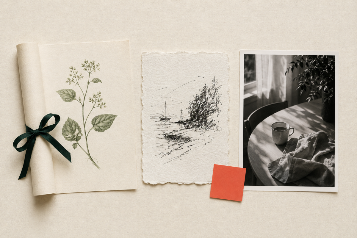
Sourcing from at least two or three different places, rather than one retailer’s art section in a single trip, is what actually creates the mixed, collected feel that reads as curated. Each source below tends to bring a slightly different visual character, which is exactly the point.
- Print-on-demand and independent art sites. Sites that let independent illustrators and photographers sell prints of their own work tend to have a far wider visual range than a single retailer’s in-house art selection, and pieces here rarely look like anything already hanging in ten thousand other apartments.
- Local art fairs and small makers. A single original or small-run piece from a local maker, even a small one, adds genuine one-of-a-kind character that no print, however well chosen, can fully replicate. Prices at local fairs vary widely, so it’s worth browsing before committing, but even one piece from this source changes how the rest of the wall reads.
- Museum and gallery gift shops. Museum shops sell affordable prints of pieces from their actual collections, often for less than a mass-market decor retailer’s original prints, and they carry an instant sense of intention that generic decor art doesn’t.
- Your own photos, printed and framed well. A personal photo, printed at a real photo lab rather than a home printer and framed with the same care as a purchased print, reads as more curated than almost anything you could buy, precisely because it can’t be bought by anyone else.
Mixing even two of these four sources on one wall does more for the collected feel than doubling your budget within a single source ever would.
The Framing Rule That Matters More Than the Art
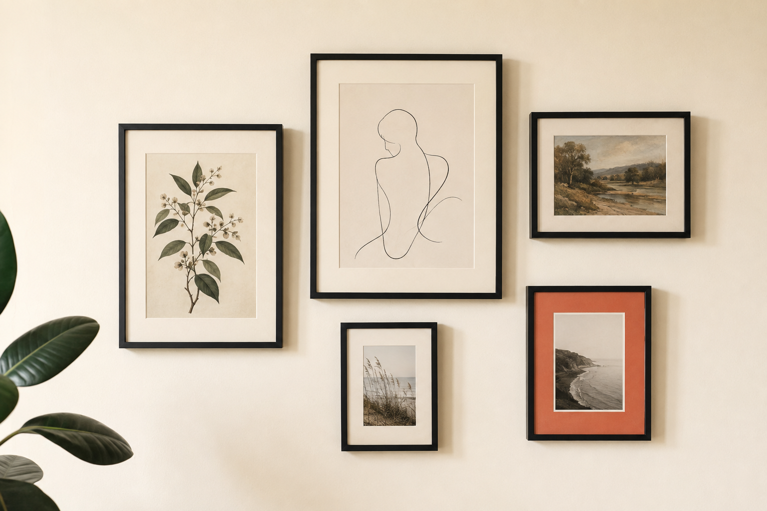
Framing every piece in the same color and finish, even when the art itself is wildly different in style and source, is what actually unifies a mixed wall into something that reads as one considered collection rather than a random assortment. A matte black frame around a botanical print and the same matte black frame around a personal photo tie the two together visually, even though nothing else about them matches.
This single rule does more work than any other decision on this list. Without it, a genuinely well-sourced mix of pieces can still read as cluttered or accidental, because the eye has nothing consistent to organize the variety around. With it, five completely different prints from five different sources read as a single deliberate collection.
Pick one frame color and finish, whether that’s matte black, natural wood, or brushed brass, and use it across every piece on the wall. Vary the frame size freely to match each piece, but keep the color and finish locked.
How to Arrange Mixed Pieces So They Read as a Collection
Vary the size of each piece deliberately, anchor the arrangement with one larger piece rather than several similarly sized ones, and leave uneven but intentional spacing between frames, since a wall of same-sized pieces evenly spaced reads as a grid rather than a collection. Grids feel purchased. Uneven, deliberate spacing feels assembled by hand, because it was.
A few specifics that help this go smoothly:
- Pick one anchor piece, larger than the rest, and build outward from it. This mirrors the same principle behind styling a single focal point, applied to a grouping instead of one object.
- Vary spacing between two and four inches, not a uniform measurement. Perfectly even spacing is one of the fastest tells of a rushed, single-trip purchase.
- Lay the arrangement out on the floor first. Trace the outline on paper, or just look down at it, before committing to nail placement. This catches spacing and balance problems before they’re permanent, especially useful in a rental where each hole matters.
- Leave one small gap intentionally. A slightly asymmetrical arrangement, with a little more breathing room on one side than a rigid grid would allow, reads as considered rather than crammed.
Frequently Asked Questions
Does a mixed gallery wall need to have art from three different sources? Not exactly three, but at least two genuinely different sources makes a real difference. A wall built entirely from one retailer’s matching art collection is the fastest way to lose the collected, curated feeling, even with great individual pieces.
What frame color works best for tying mismatched art together? Matte black, natural wood, and brushed brass all work well as a unifying choice. What matters most is picking one and using it consistently across every piece, rather than which specific color you choose.
Is it worth spending more on individual prints to make a wall look curated? Not necessarily. Source variety and consistent framing do more visual work than the price of any individual print. A budget print in the right frame, sourced alongside other varied pieces, often outperforms an expensive print bought as part of a matching set.
How do I arrange mismatched art without it looking cluttered? Anchor the grouping with one larger piece, vary spacing instead of using a uniform grid, and lay the arrangement out on the floor first before hanging anything. Uneven, deliberate spacing is what separates a curated wall from a cluttered one.
Related Reading
For the method behind identifying which single piece in a room is worth the most careful sourcing, The Complete Guide to Getting the Look for Less covers how to spot a room’s hero piece before you shop.
If your art grouping is meant to anchor a specific corner or wall, How to Style One Focal Point When You Can’t Redo the Whole Room covers how to build the rest of the styling around it.
For rental-specific hanging methods that keep this kind of arrangement damage-free, Rental-Friendly Decor That Actually Looks Intentional covers every removable-hanging option by wall type.
Browse the full Get the Look for Less category for more sourcing-focused guides, or explore the wider Budget Decor hub for thrift-first and DIY-friendly styling ideas.