Table of Contents
The most common color advice for small rooms is also the most misleading: paint it all white and it’ll feel bigger. Plenty of small bedrooms are already painted a flat, stark white and still feel cramped, boxed in, and a little cold. White isn’t the fix. The right value, the right undertones, and the right amount of contrast are the actual fix, and white is only sometimes part of that answer.
A small bedroom opens up when its palette has enough light to feel airy but enough contrast and warmth to feel like a real room instead of an empty box. This guide covers the specific combinations, placement rules, and testing methods that get you there without repainting the whole apartment.
If you haven’t yet worked through lighting, start there first. The lighting guide for small bedrooms covers why bulb temperature changes how every one of these colors will actually read on your walls, and it’s worth fixing before you commit to paint or textiles.
The Small-Bedroom Color Mistake That Backfires
Painting every surface the same flat white, with no other color or contrast anywhere in the room, is the single most common color mistake in small bedrooms, and it does the opposite of what people expect. Without any contrast to define where one surface ends and another begins, the eye can’t read the edges of the room clearly, and a room without visible edges reads as vague and boxy rather than open. A small room needs at least some contrast to actually register as a room with depth, not just a lack of color to feel bigger.
The fix isn’t necessarily to add more color. It’s to add enough value contrast, meaning a range from lighter to darker tones, that the walls, floor, and furniture each read as distinct planes instead of blurring into one flat surface.
Value Matters More Than Hue
Value is how light or dark a color is, independent of what color it actually is, and it matters more to how a small room feels than the specific hue on the paint chip. A pale blue and a pale sage can feel almost identical in a room because they share a similar light value, while two colors that are technically “neutral,” like a stark white and a warm greige, can feel completely different because their values sit further apart.
For a small bedroom, keep your largest surfaces, walls and floor, in a light-to-mid value range so the room still reads as open. Then use a darker value somewhere specific and contained, a single wall, a piece of furniture, or your bedding, so the room has somewhere for the eye to land instead of drifting across one flat wash of light color. A room with zero value contrast feels less finished than a room with one deliberate dark note, even though the second room technically has “less white” in it.
Palettes That Actually Open a Small Bedroom Up
These four combinations work specifically because each one pairs a light, warm dominant tone with one grounding note, rather than leaning on white alone.
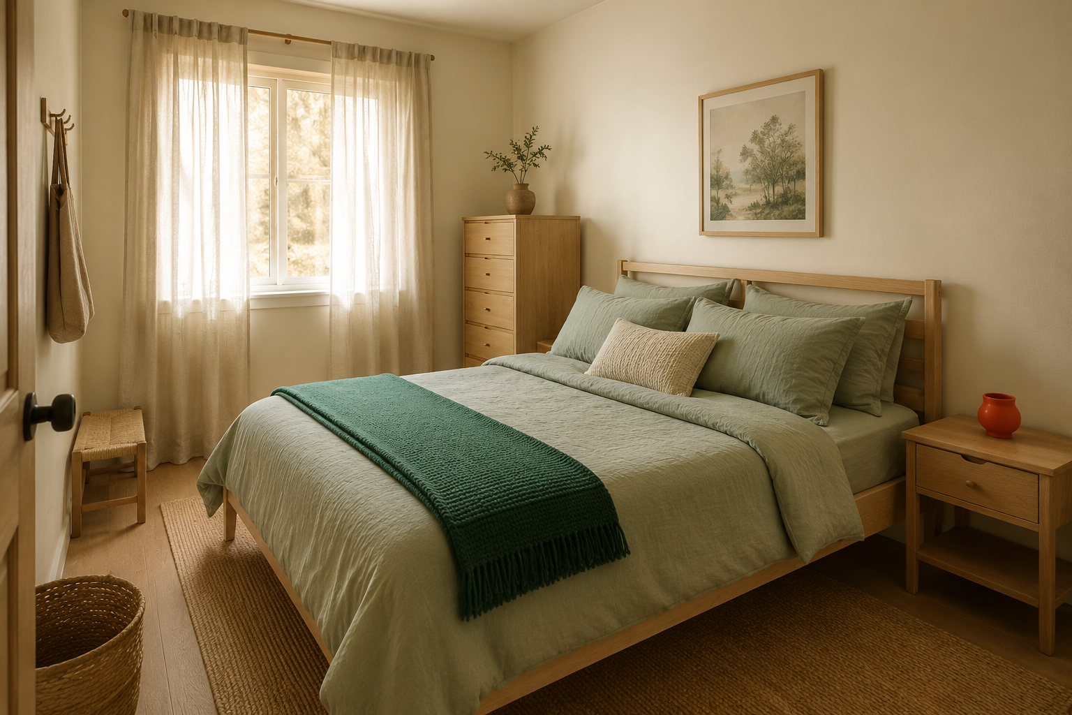
Warm cream and sage green. Cream walls and bedding with sage green in a throw, a lampshade, or a single dresser piece. This combination reads calm and slightly botanical without ever feeling cold, and it works in rooms with both warm and cool natural light.
Soft greige and warm wood tones. A warm gray-beige wall paired with natural or honey-toned wood furniture and brass hardware. This one works especially well in rooms that get less natural light, since the warm wood keeps the gray from reading flat or institutional.
Blush and terracotta. A soft, dusty blush wall or bedding with one terracotta or rust accent, like a vase or a woven basket. This pairing has more personality than the first two and suits a bedroom meant to feel a little more expressive.
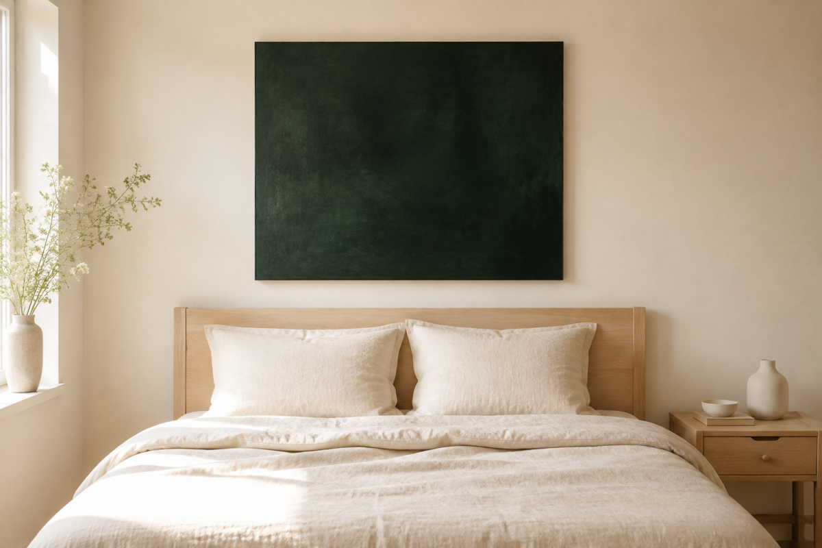
Warm white and deep charcoal. Warm white, not stark white, on the majority of the room, with charcoal contained to one wall, a headboard, or bedding. This is the highest-contrast option on this list and works best in bedrooms with strong natural light, since charcoal in a dim room can read heavy rather than grounding.
Pick one, not a combination of all four. Mixing palettes across the same small room is what leads back to the visual chaos this guide is trying to help you avoid.
Where Color Can Go Bold Without Shrinking the Room
A small bedroom can hold more saturated or dark color than most people expect, as long as it’s contained to a single, deliberate plane rather than spread across the room.
The wall behind the headboard is the most forgiving spot for a bold color, since it sits behind the largest piece of furniture in the room and doesn’t compete with the ceiling or the door wall. The inside back panel of an open bookshelf is a smaller, lower-commitment option that still adds real depth. Even the ceiling itself, painted one shade darker than the walls, can make a small room feel more intentional instead of smaller, since a slightly darker ceiling reads as a deliberate design choice rather than a boundary closing the room in.
What doesn’t work is spreading one bold color across two or three different surfaces in the same small room. That’s the point where a confident accent color turns into visual noise.
Undertones: The Detail That Makes “Neutral” Palettes Clash
Two colors described as “neutral” can still visibly clash if their undertones don’t match, and undertone mismatches are one of the most common reasons a small bedroom palette feels slightly off without an obvious explanation. Warm undertones lean toward yellow, peach, or tan. Cool undertones lean toward blue, gray, or pink-gray. A cream wall with a warm undertone paired against a cool gray rug will read as mismatched even though both pieces are technically neutral on their own.
Before committing to a palette, hold your paint swatch, your bedding, and your rug together in daylight, not under artificial light. If one piece runs noticeably cooler or warmer than the others, that’s the piece to swap before you finalize anything else.
Test a Palette Before You Commit, Especially in a Rental
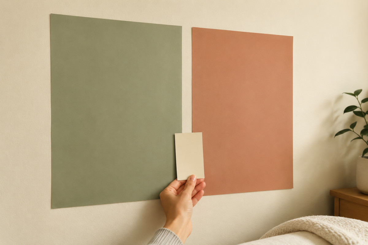
You don’t need to repaint a wall to know if a color works. Peel-and-stick wallpaper samples let you test an actual pattern or color at real scale on one section of wall, and most brands sell sample sizes specifically for this. Removable paint swatches, larger than the small chips at the hardware store, give a more honest read of a color across several square feet instead of a two-inch square. And laying your bedding and rug together on the floor before buying either one lets you catch an undertone mismatch before it becomes a returns problem.
Frequently Asked Questions
What color makes a small bedroom look bigger? No single color does this on its own. A light, warm neutral on your largest surfaces combined with one deliberate darker or bolder note, on a single wall or piece of bedding, opens a small room up more effectively than an all-white room with no contrast at all.
Is white always the best choice for a small bedroom? No. Stark, cold white without any contrast or warmth can make a small room feel flat and vague rather than spacious. A warm white or cream, paired with at least one contained darker accent, tends to read as more open and more finished than an all-white room.
Can I paint a small bedroom a dark color? Yes, as long as it’s contained to one plane, like the wall behind the headboard, rather than spread across the whole room. A single dark wall in an otherwise light room reads as cozy and intentional. Dark color on every surface tends to make a small room feel smaller.
How do I know if two neutral colors will clash? Hold them together in natural daylight, not under artificial light, and check whether one leans warmer, toward yellow or tan, while the other leans cooler, toward blue or gray. Undertone mismatches are the most common reason two “neutral” pieces don’t actually look right together.
Related Reading
- Lighting changes how every color in this guide will actually read on your walls. Start with the small bedroom lighting guide if you haven’t already.
- For the full sequence this color guide fits into, the complete small bedroom decorating guide covers texture and finishing touches next.
- Once your palette is set, the small bedroom layout guide covers where furniture should sit against your new colors.
- For more palette and styling approaches for this room, visit the Bedroom Decor category page.
- To see how this fits into organizing every room in a small home, start at the Small Bedrooms hub.