Table of Contents
Two rooms can use nearly identical budgets and still look worlds apart, and the difference almost never comes down to how much was spent. It comes down to four specific things: material texture, color restraint, correct scale, and light quality. Get those four right and a room reads as expensive even when nothing in it actually was — which is exactly why some of the most-photographed budget rooms online cost less than the plain, mismatched setups they get compared against.
This guide breaks down exactly what those four factors are, how to spot the affordable version of any expensive-looking piece, and which popular looks have the easiest dupes right now.
What Actually Makes a Room Look Expensive
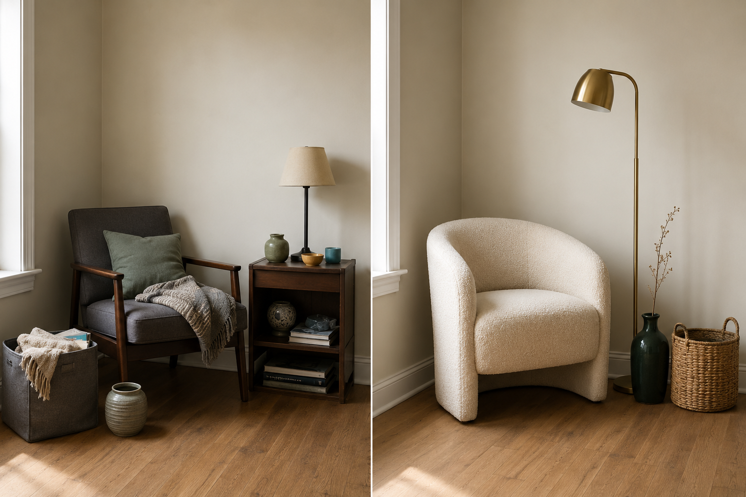
A room reads as expensive when it has restrained color, varied texture, correctly scaled furniture, and warm, layered lighting — not when the individual price tags are high. These four factors do almost all of the visual work, and every one of them is achievable on a small budget.
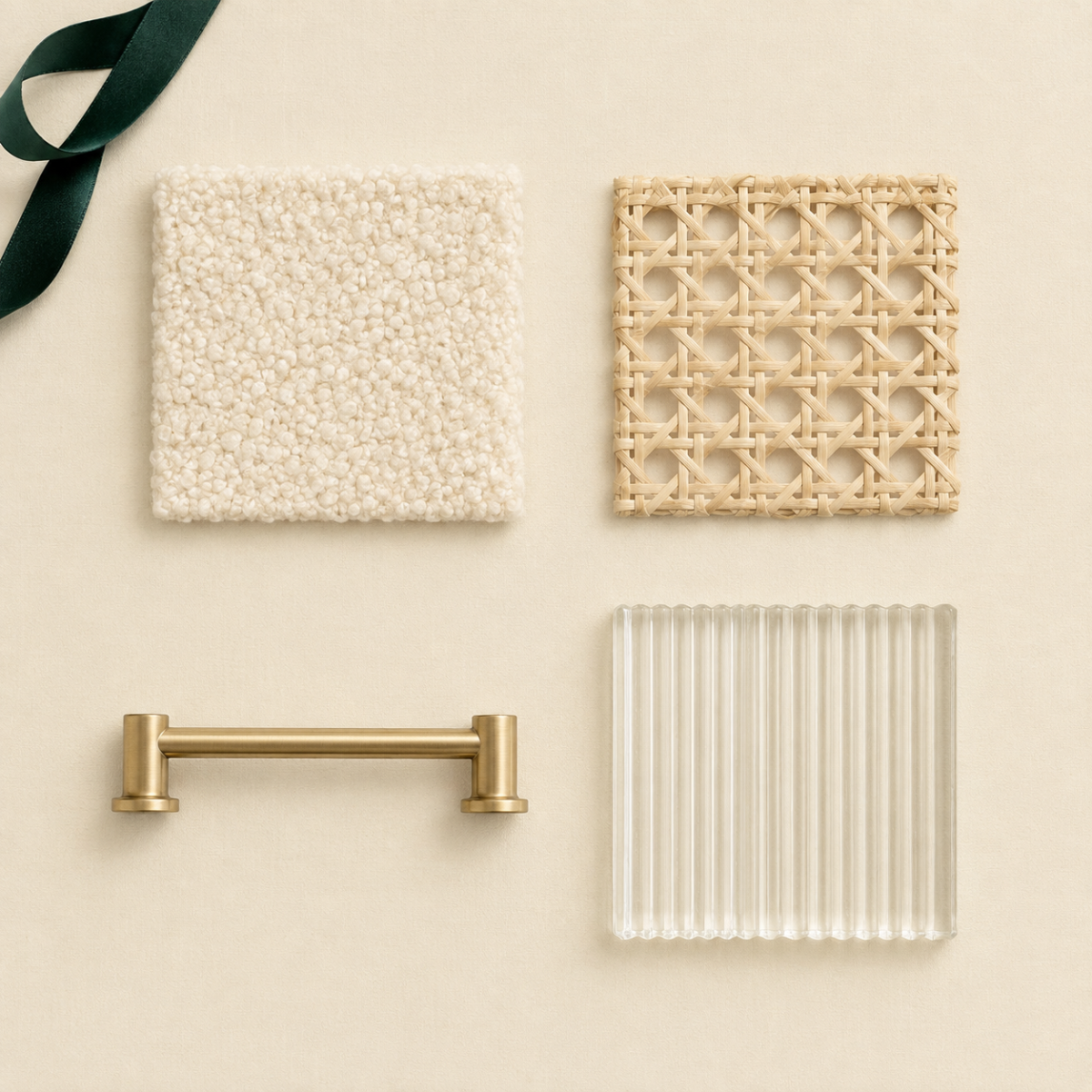
Material texture. A room with only smooth, flat surfaces (basic cotton, plain painted wood, glossy plastic) reads as cheap regardless of price. A room with at least two or three different textures — a nubby boucle throw, a woven rattan basket, a matte ceramic vase — reads as considered, because texture is what most people register as “quality” even when they can’t name why.
Color restraint. Expensive-looking rooms almost always commit to a narrow palette: two or three main colors, repeated deliberately, rather than five or six colors competing for attention. This costs nothing extra — it’s a decision, not a purchase.
Correct scale. Furniture and decor sized appropriately for the room (not too small and scattered, not oversized and cramped) reads as intentional. An undersized rug or an art piece that’s too small for its wall is one of the fastest ways to make an otherwise nice room look like an afterthought.
Light quality. Warm, layered lighting (a mix of overhead, table, and floor sources, all in a similar warm color temperature) does more to elevate a room’s feel than almost any single furniture purchase.
The Dupe-Finding Method
Search for the silhouette and material, not the brand name, and you’ll consistently find the affordable version of almost any popular look. “Curved boucle swivel chair” finds you the shape and texture that’s actually doing the visual work, regardless of which retailer made the expensive original.
Most expensive-looking pieces are expensive because of brand, not because the underlying material or construction is unreachable at a lower price point. When you’re hunting for a dupe:
- Identify the silhouette — is it curved, boxy, tapered-leg, low-profile? This matters more than the material.
- Identify the material or texture — boucle, rattan, brass-toned metal, fluted glass, marble-look surface.
- Search that combination, not the original product’s name — “curved boucle accent chair,” not a specific retailer’s product line.
- Check secondhand marketplaces first — many popular expensive silhouettes get resold within a year or two once trends shift, often at a third of the original price.
This method works because most “look” trends are really shape-and-texture trends wearing a brand name. Once you can name the silhouette and material separately from the price tag, you can find it across a dozen retailers instead of feeling locked into whichever one popularized the look first.
Room-by-Room Dupes for Popular Looks
Living room. The boucle or curved-silhouette accent chair is one of the easiest dupes on the market right now — the shape and fabric texture, not a specific designer name, are what makes it read as expensive. A fluted or ribbed glass vase gives the same light-catching effect as pricier art-glass pieces. A jute or wool-blend rug in a neutral tone mimics higher-end natural-fiber flooring for a fraction of the cost.
Bedroom. A linen or linen-blend duvet cover reads as “quiet luxury” regardless of thread count claims — texture and drape matter more than fabric origin. A curved or arched mirror leaned against the wall (rather than a boxy framed one) mimics a much pricier statement piece. Brass-toned (not solid brass) hardware on an existing dresser upgrades the whole piece for under $20.
Kitchen. Open shelving styled with a small, coordinated set of ceramics (rather than a cluttered mix of mismatched dishware) gives an editorial, expensive-feeling look for the cost of a few matching pieces. A wood or marble-look contact-paper counter runner under styled objects mimics stone counters in a rental where replacing counters isn’t an option.
Home office. A curved or tapered-leg desk silhouette reads as higher-end than a boxy rectangular one, often at a similar price point. A woven or cane-backed chair gives the same textural upgrade as pricier designer seating.
When a Splurge Actually Beats the Dupe
A dupe is the right call when the visual impact comes from shape, color, or texture — things a cheaper version can replicate exactly. A splurge is worth it when the expensive version is solving a functional problem the dupe genuinely can’t, like real structural support in a chair you sit in daily or a mattress you sleep on every night.
The honest way to tell the difference: if you’d be equally happy with the dupe in a photo but not in daily use, it’s a functional gap, not a style one, and that’s where spending more is worth it. If the dupe looks identical and functions identically, the only difference is a brand name — and that’s exactly what this guide exists to help you skip paying for.
Mistakes That Make a Dupe Look Cheap
A good dupe fails when it’s paired with the wrong context, not because the piece itself was a bad choice. The same $80 chair can look like a smart find in one room and like a budget compromise in another, depending on three things people consistently get wrong.
Buying the dupe but skipping the color restraint. A well-chosen boucle chair still reads as budget if it’s placed in a room with five competing colors around it. The dupe only does its job when the rest of the room follows the same restrained-palette rule covered earlier in this guide.
Ignoring proportion to save money. A smaller, cheaper version of a statement piece — an undersized mirror, a rug that doesn’t reach the furniture — reads as a compromise even when the material and finish are otherwise convincing. If a dupe is meaningfully smaller than the piece it’s replacing, size up before you buy, even if that means spending slightly more.
Mixing too many finishes at once. One expensive-looking room usually commits to one or two metal tones (brass-toned hardware throughout, not brass here and chrome there) and one dominant material story. A dupe chair in the right texture still looks disjointed next to mismatched metal finishes on the lamp, the mirror frame, and the drawer pulls.
The fix for all three is the same: treat the dupe as one piece in a coordinated plan, not a standalone purchase. A single well-chosen dupe in an otherwise uncoordinated room rarely delivers the “expensive” feeling on its own — it needs the color and proportion rules around it to actually land.
FAQ
Are dupes actually lower quality than the original? Sometimes, but not always in ways that matter for decor. A dupe boucle chair might have a slightly less durable fabric blend than a premium original, but for a piece that’s decorative or lightly used, that difference rarely shows up in daily life.
How do I find dupes without knowing the “real” product name? Search by silhouette and material instead — “curved boucle chair” or “fluted glass vase” — rather than trying to guess which specific retailer’s product you’re picturing. This method finds the visual match regardless of brand.
What’s the fastest way to make a room look more expensive without buying anything new? Narrow your existing color palette. Pack away decorative items that don’t fit your main two or three colors, even temporarily. Restraint alone changes how a room reads.
Is secondhand a good source for “look for less” pieces? Often the best source. Popular silhouettes and trends get resold as people redecorate, so a secondhand marketplace search for the specific shape and material you want frequently turns up options at a third of retail price.
Which single item gives the best “expensive” upgrade for the least money? Lighting, in most rooms. Swapping harsh overhead light for a warm-toned lamp or two changes how every other object in the room reads, often for under $30.
Can I mix dupes from different “look” styles in one room? Only carefully. Two dupes from different aesthetics (say, a boho rattan chair and a strictly minimalist glass table) can clash even if each one is individually convincing. Pick the four factors — texture, color, scale, light — from one coherent direction before adding a second style’s pieces into the same room.
Related Reading
- The Complete Budget Decor Guide — the full styling → swap → DIY sequence this guide fits into
- Budget Styling Guide — where to spend and where to save, room by room
- DIY-Friendly Updates Guide — which small projects are worth doing yourself
- Complete Guide to Getting the Look for Less — related Taims Space guide.
- Dupes for High-End Furniture Brands — related Taims Space guide.
- Designer Lighting Looks for Less — related Taims Space guide.
- Affordable Wall Art and Decor — related Taims Space guide.
- Where to Find Secondhand Furniture and Decor — related Taims Space guide.
Category: Get the Look for Less Hub: /budget-decor/
Reviewed by the Taims Space editorial team.